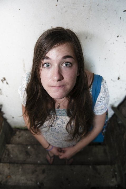


Though tedious, I really had a great time doing the text portraits. I think out of all the projects we did in this course, this came out the best. I think the photos I chose of myself were really fun expressions to capture. Both the shape and the value portraits were very playful, while the line portrait had a more serious expression. Since I am a fine art student, I really used what I learned about shape, value, and line in my past studio classes. I used my knowledge that less is sometimes more when trying to portray facial features. I went with the idea that sometimes it is better to make marks where the shadows are rather than trying to outline everything. I think this principle really helped me create a great project.
No comments:
Post a Comment